


Wondering how to make the best YouTube thumbnails?
Thumbnails that grab potential viewers and make them click to watch?
When you’re creating videos for YouTube, the thumbnail might not seem important.
You might be thinking – as long as the content is good, the thumbnail doesn’t really matter.
Think again!
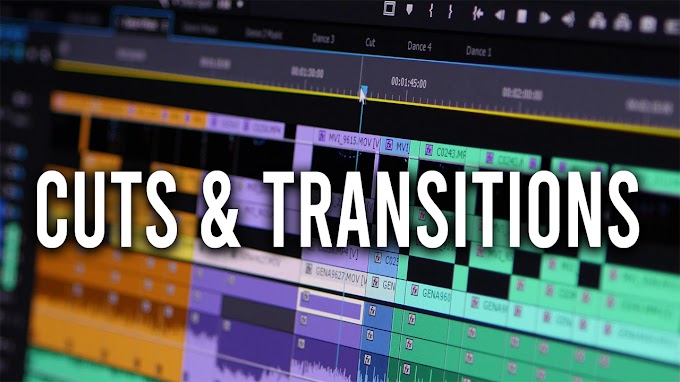
This video show the work i put on my thumbnails. keep in mind that you are not obligated to make it complicated and work witch many layers, you can always keep it simple.
In General i make my thumbnails with one image in the background, i add coloring to the image to make it pop out then i put the text. but this time i decided to make more effects on the thumbnail to show you as many as possible the technics i use ( masking, blending, coloring ...)
How to make YouTube thumbnails: best practices
Because many asked me how i make my thumbnails, here are 5 key tips to get started.
1. Use the right YouTube thumbnail size
If you’re going to spend the time to create a professional looking thumbnail, start with the proper sizing and dimensions.
Per YouTube’s guidelines, your thumbnail image should be 1280 x 720 pixels, with a minimum width of 640 pixels. An aspect ratio of 16:9 is ideal as it’s used most often in YouTube players and previews.

Making a thumbnail image that’s too small is a big mistake. Although thumbnail images show up relatively small in the YouTube search results, don’t forget that YouTube videos can also be embedded.
For this reason, you want a larger image size that can be scaled down, instead of a small size that will be scaled up. This will ensure top quality.
In addition, you need to save as JPG, GIF, BMP, or PNG image formats, and keep the file size under the 2MB limit.
2. Use a great photo as your YouTube thumbnail background
Strong visuals are essential to grab the attention of your viewers.
A high-quality picture that acts as a teaser for the video will not only give context, but it’s also an opportunity for your audience to familiarize themselves with your style.
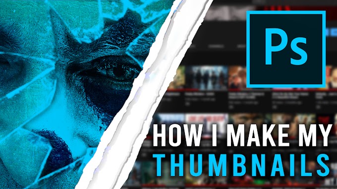
For me, most of time i take a screen shot from the video then i work on it on photoshop. But if didn't find the perfect frame to capture it on your video you can dawnload FHD wallpapers. I use this site HDWallpapers
3. Include title text in your YouTube thumbnails
Adding text headings on your video thumbnail holds many benefits, but the biggest benefit is that it gives the viewers more context about your video.
A simple image, no matter how beautiful, isn’t going to communicate that your video is a brilliant tutorial that’ll solve one of your viewers’ most pressing problems.
Capture that core idea into a compelling title that will grab those who’ll enjoy your video
If you create a series, the text headings in the thumbnail could be numbered. Much like a TV show with numbered episodes and seasons, numbered YouTube thumbnails will help your viewers keep track of the content they are consuming.
Plus, it prompts them to look for more!
4. Use the best font for your YouTube thumbnails
Now that you’ve got a title, you need to pick a font.
It’s always important to familiarize your audience with your brand and your content. A good way to do this is to keep your thumbnails consistent with the same style fonts, memorable colors, and a strong design.
If you’ve determined your business visual branding already, that’s awesome. Use your headline font for your title text.
If you haven’t, choose a nice, clean headline font in a design tool like Snappa. You want something that’s clear and easy to read at a glance.
A sans serif or “gothic” font works well. Bold or Heavy weight is a good choice.
Beware of script fonts, outlines, or fonts with lots of thick and thin variation that make them hard to read at a glance.
5. Use good contrast in your YouTube thumbnail design
As we’ve mentioned, including a title in your thumbnail is important. But if you can’t even read it, then what’s the point? That’s where contrast comes in.
While there’s many different types of contrast, the most important one to consider is color contrast. If two colors are different from each other (say, black and white) they have high contrast, whereas if they are very similar (red and orange) then they have low contrast.
Let’s take a look at the following example:

When comparing the two, it’s much easier to read the word on the left compared to the word on the right. That’s because purple contrasts with yellow much more than orange does.
When designing your thumbnail image, always make sure that your text contrasts nicely with your background. If necessary, you can use a tool like Adobe Color to make sure that your colors contrast effectively.
Conclusion
The importance of video thumbnails on YouTube can’t be overstated.
Not only do they make a big impact in terms of click through rates, they also play a key part in branding your channel.

0 Comments